Configuration
For our theme to run smooth we need a proper configured environment. The more the plugin the more the resources it consumes and requires a bit more controllable environment. Even theme works fine. But we suggest a bit more resources and control. Please check-out the things below:
max_execution_time 300This is important if you're going to use one click demo import. If server supports allowsmax_execution_timeto be modified it is handled by our theme.memory_limit 256MMost of the server supports this and our code handles this one too but in case if it's not supported then please ask your host to increase your memory limit.- You're now good to go..! Proceed to the installation steps below.
Installation
Follow the steps below to get started with your WordPress Theme
- Please follow the famous 5 minutes installation tutorial to install WordPress if it's not already installed.
- Please unzip the downloaded file and place it to location which is accessible with ease. Open the folder. You'll be presented with 4 sub folders demonstrated below:
Documentation- This documentation file main folderPlugins- Premium & our framework pluginsThemes- Core theme & child themeSample Data- All the demos & files are placed here in case you'd like to do manual import.
- Inside the theme folder there are two more zip files.
zutta.zip- Main theme filezutta-child.zip- Child theme
- Now Login to WordPress admin dashboard. Go to
Appearance>Themes>Upload theme. Upload zutta.zip and Activate themes. - Now please install all the necessary plugins and activate them.
- Navigate Through
Appearance>Demo Importerto clone accordingly.
Installing Plugins
When you click on "Activate" button to activate Zutta Theme, you will see the a notice offering you to install required and recommended plugins. Click "Begin installing plugins", on the screen that appears, next select the plugins you want to be installed, pick "Install" in Bulk Actions select box and click "Apply" button. For optimal user experience install and activate all recommended plugins.
Installing Demo Data
Warning
You should not install sample data on an existing website - it's database will be deleted and replaced with sample one. You also should not run sample data installer on a WordPress MultiSite - the database for all you overwritted as well. As long as you are using one database for several sites all of these sites may be lost.
Warning
Please note that images used on our live demo cannot be used on your live sites build with the help of our theme. You should only use properly licensed images on your live projects. Images you see on our live demo are not sold with the theme and therefore are not included in the theme package.
Steps to import demo data:
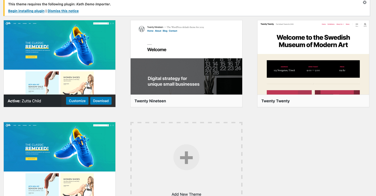
- Navigate Through
Appearance>Demo Importerto clone accordingly. - You will be preseneted with all the demo available:

- Click on the
Importand follow the process. - For any reason/issues if you are not able to import demo data from above steps, then you can import all dmeo data manually and the sample data is located in
Sample Data. To import widget you will need to install Widget Importer Exporter plugin to import widgets which is placed underSample Data>widgets.wie. For sliders you can directly import from the Slider Revolution and the zip file of both banner are also located under same folder.
Theme Options
Zutta comes with advanced settings panel that is loaded with options. We have the options organized into logical tabbed sections, and each option has a description of what it will do on the front end. We encourage you to please take some time and navigate through each tab to see what we offer. Go to Zutta Theme Options on admin sidebar to access the setting options. See below for screenshots and short descriptions of our Theme Options panel.
You can find Theme Options in Appearance > Zutta Options.
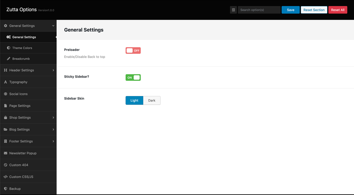
General Settings
General Settings tab allows you to define the site width, enable or disable Back to Top button, upload two different variaiton of logo for normal screen and high resoluton[retina] screen and upload fav icon for your site.
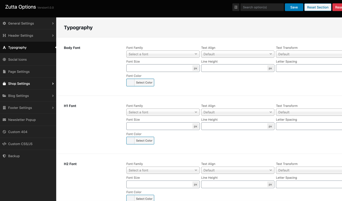
Typography Options
Typography setting tab is one of the most important options which will allow you to customize the looks of your sites typography. It allows to set font family, font size and font color for your sites general use. It also allows you to choose font family and size for all header types i.e. H1, H2, H3, H4, H5, H6 etc. You can set different font size for each head tag. This options allows you to choose font color for anchor tag and its hover/active state.
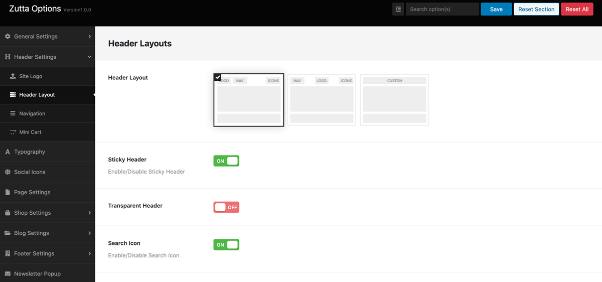
Header Settings
Header setting will give you options to control the looks of the header part of your site. There are three main options: Top Bar, Header Style and Sticky Header. Top bar is used for showing shipping info or promo options on the top section of your header. This can be easily switched on and off from backend. In frontend there is an icon to collapse or show the bar for your visitors. Header Style will allow you to choose availabel header styles in the theme. Currently there are two type of header style for you to choose from and more coming soon. Sticky header otion is to make the header sticky or not when your visitors slide towards bottom section of your site. When visitors scrolls down then the header will remain sticked on the top section of the site.
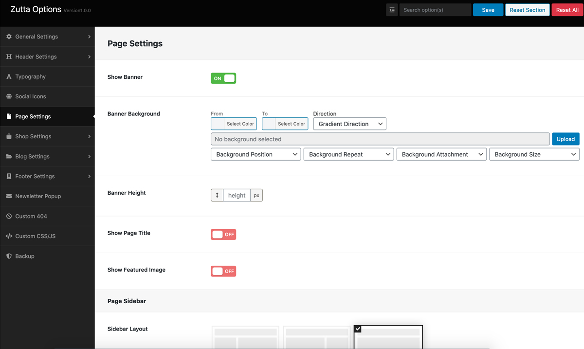
Page Settings
This option will allow you to set page banner image or color for all pages. Beside this option there is same option for individual page as well. This is a general setting for page banner so if you set any image or color here it will apply to all pages through out the site except homepage. This option will be over written by the page banner if you set one in individual pages.
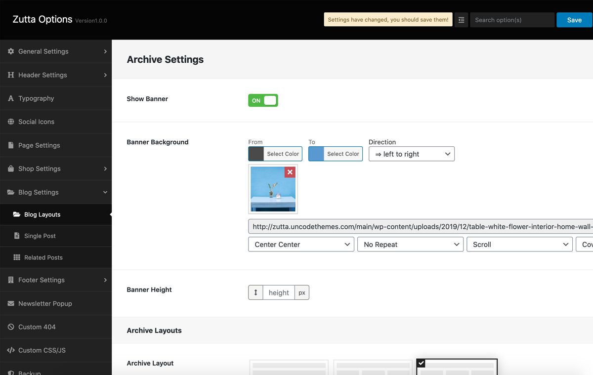
Blog Settings
Blog setting section has lots of option for you to control the view and looks of the blog and its associated pages. We have provided many blog layouts which you can choose one that best fits your requirements.

1. Title Bar
This option allows you to set banner imagr or color for the blog pages which includes archive page, post single page and search result page. You can choose to use background image or a single flat color as banner. You also can enter the blog archive page title.
2. Choose Blog Layout
This option allows you to the layout of your main blog page. We have provided three pre-defined layout for the blog page: Classic, Massonary and Modern.
3. Excerpt Length
We have given this option here to control the Excerpt Length but we prefer to do this option from WordPress default settings
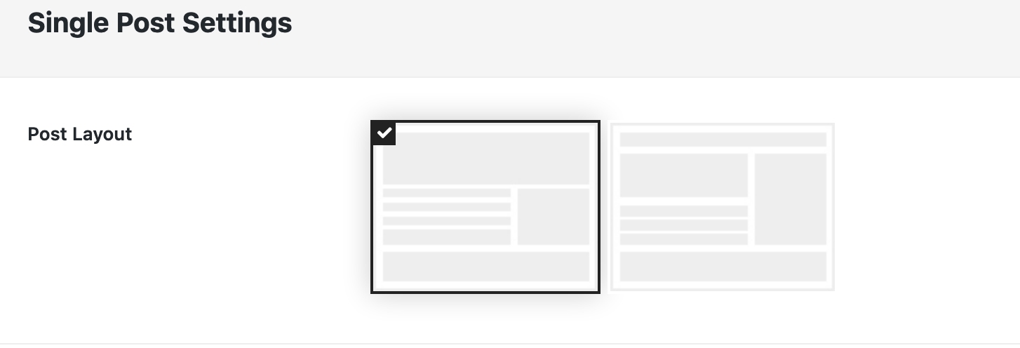
4. Post details page layout
This option allows you to choose layout for post details page. Currently there are two type of layout: Classic and Modern. Classic is the normal layout with sidebar and Modern is a custom designed layout without sidebars.

5. Sidebar
This option allows you to choose the sidebar and its position. This sidebar option will apply in in Class blog layout and Classic post details page layout.

6. Related Post
This option allows you to choose how many post to show in related post section of blog single page. Beside the number of post it will also allows to show or hide this section.

Shop Settings
Shop setting tab has lots of option to control your shop page looks and layout. The first option is the Title bar which will allow you to apply a background image or color for the banner section. Number of products option will allow you to control how many products to show in a single page and rest of products will appear in second page. Pagination will automatically display when number of products acceed to the number you have set in Number of products option. We have two layouts for shop page: Full width and Two Columns. Full width option will display products fitting within the container area where as Two column option will display products as well as sidebar positoned on Left or Right side of the page. Sidebar option will allow you to choose sidebar position: Left or Right and assign a sidebar that you have created.


Product Single

We have added theme option for product single page settings. This option allows to choose product single page layouts, and other misc. settings for product single page i.e. social share icons, descriptions show/hide etc.
Product Badge

We have added theme option for product badge settings. From this option the WooCommerce sales badge and out of stock badge can be styled and positioned as per requriements. For stock badge you will need to enable stock management from WooCommerce Product backend.
Related Products

We have added theme option for related and upsell product settings. This option allows to choose number of products and number of columns to show in related and upsell product section of product single page.
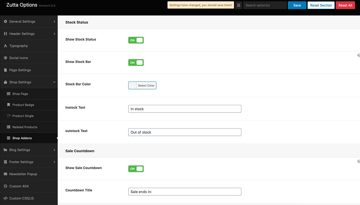
Shop Addons
We have added lot of features that can enhance your online store. These addons are conversion focused and will help you convert more sales from your visitors. These addons are visible in products single page.
- Stock Status : If you have enabled the stock management option from the WooCommerce products page and entered stock quantity in backend then this addon will show a progress bar of your remaining stocks of the item in real time. You have option to choose stock bar color. Good thing is when your stock is below 30% of the total stock the bar will change its color to red automatically showing urgency to the visitor.
- Sales Countdown : If you have any products on sale with fixed start and end date for the sales then this addon will display a attractive countdown times in the products single page. You have option to add title to the counter which will display just above the counter.
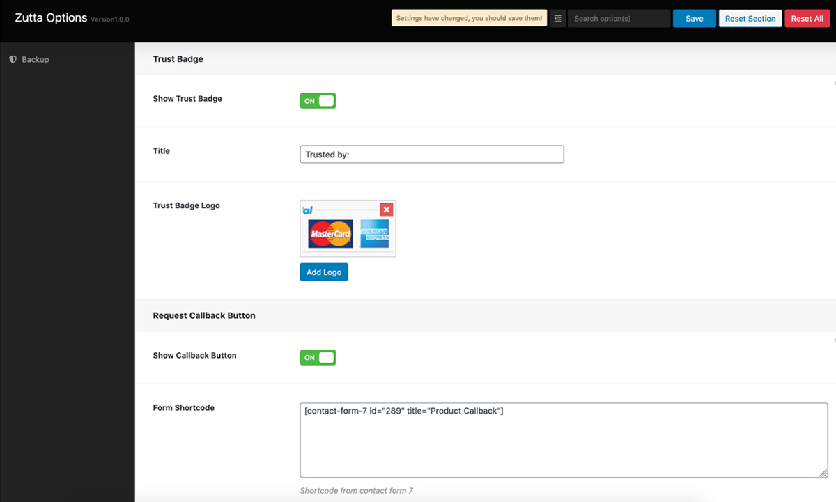
- Trust badge : This addon wil help you build trust with your visitor. Showing a trust badge in products single page. You have options to upload an image and title of this section which will display below the add to cart button.
- Request Callback Button : This addon will help you easily configure a request callback form on the product single page from where the visitor can send an inquiry of the products to admin.
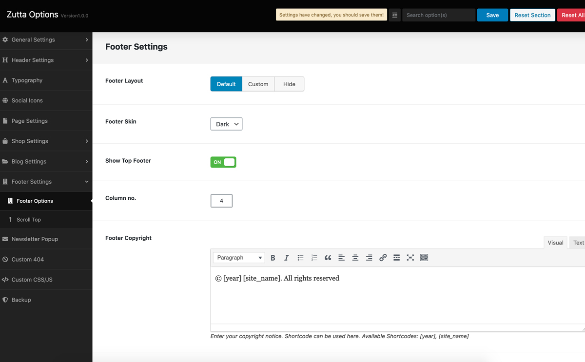
Footer Settings
Footer setting has lots of options to control the layout and looks of the footer section. There are two option for footer section looks i.e. dark layout or light layout. Beside the layout there is an option to use default layout [hard coded] or can also assign custom template designed from Elementor plugin. You can assign different widgets in the footer section. Based on the number of widget you assign from here, widgets will be created automatically in the widget section where you will just need to drop the wdigets and its ready. Google Analytics section can be used to place any tracking code that you would like to use for your site. Just a note when you paste tracking code make sure you do not use script tag. Copyright message basically you do not need to do anything here.
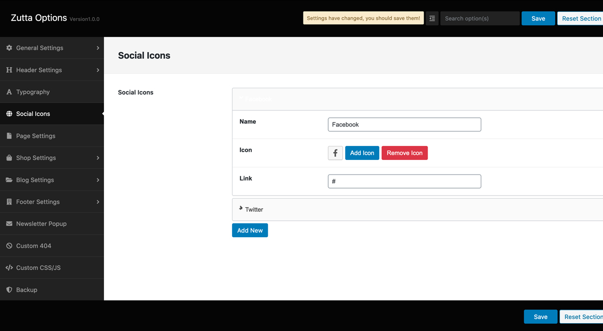
Social Media
We have given an option for adding social icons. There are option to add unlimited social channels for the site.
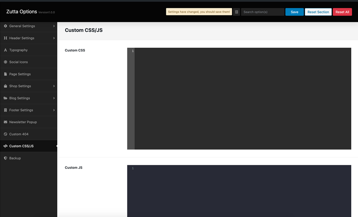
Custom CSS & JS
This is the option which will allow you to add your custom CSS and JS codes to customize the looks and feel of the site but make sure you do not use script tag.
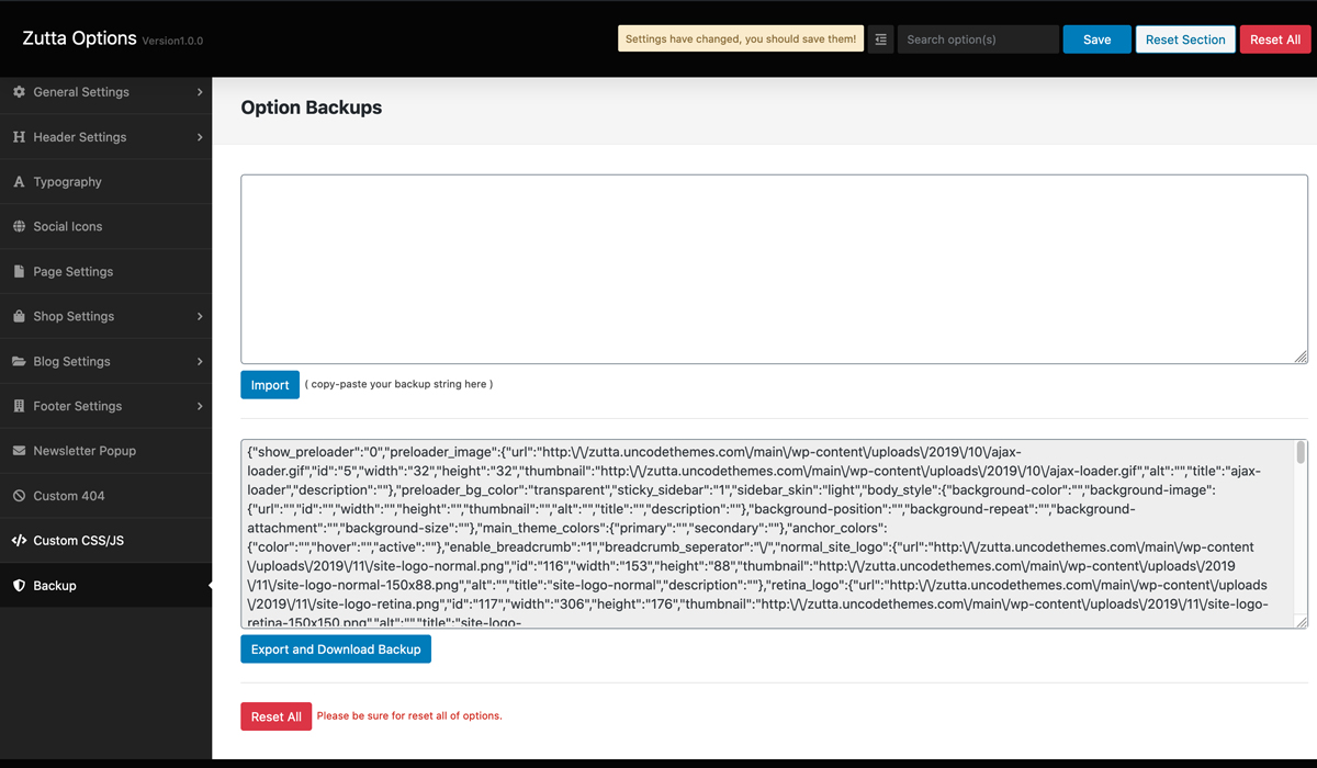
Backup & Restore
This option will allow you to import and export your theme options. Before you update the theme or do anything its safe to keep a copy of backup from here. If you click on Export and Download Backup it will give you a txt file which can be used to restore the theme options you have setup. If you like to import the theme options that you have backed up then open the txt file in text editor, copy the codes, paste codes in blank editor above the Import a Backup button and hit the button, you are done all of your theme options are restored.
Header 1
<header id="masthead" class="site-header style1 d-flex vertical-center space-between have-banner">
                                    <div class="header-left d-flex vertical-center">
                                        <div class="site-branding">
                                            <div class="site-logo">
                                                    <a href="#" class="normal-logo logo-wrapper">
                                                        <img src="..." alt="/">
                                                    </a>
                                                     <a href="#" class="retina-logo logo-wrapper">
                                                        <img src="..." alt="/">
                                                    </a>
                                            </div>
                                        </div><!-- .site-branding -->

                                        <nav id="site-navigation" class="main-navigation">
                                            <div class="menu-main-menu-container">
                                                <ul id="primary-menu" class="menu font-2 nav-menu" aria-expanded="false">
                                                    <li><a href="#">...</a></li>
                                                    <li><a href="#">...</a></li>
                                                </ul>
                                            </div>
                                        </nav><!-- #site-navigation -->
                                    </div>

                                    <div class="header-right d-flex vertical-center">
                                        <ul class="site-header-cart d-flex vertical-center">
                                            <li><a href="#" title="wishlist">...</a></li>
                                            <!--wish list-->
                                            <li class="cart-icon offcanvas">...</li>

                                            <!--cart-->
                                            <li class="login">...</li>
                                            <li class="search-icon">...</li>
                                        </ul>
                                    </div>
                                    <!--right-->
                                </header>
Header 2
<header id="masthead" class="site-header style2 d-flex vertical-center space-between have-banner">
    <div class="header-left d-flex vertical-center">
        <nav id="site-navigation" class="main-navigation">
            <div class="menu-main-menu-container">
                <ul id="primary-menu" class="menu font-2 nav-menu" aria-expanded="false">
                    <li><a href="#">...</a></li>
                    <li><a href="#">...</a></li>
                </ul>
            </div>
        </nav><!-- #site-navigation -->
    </div>

    <div class="header-middle d-flex vertical-center">
        <div class="site-branding">
            <div class="site-logo">
                    <a href="#" class="normal-logo logo-wrapper">
                        <img src="..." alt="/">
                    </a>
                     <a href="#" class="retina-logo logo-wrapper">
                        <img src="..." alt="/">
                    </a>
            </div>
        </div><!-- .site-branding -->
    </div>

    <div class="header-right d-flex vertical-center">
        <ul class="site-header-cart d-flex vertical-center">
            <li><a href="#" title="wishlist">...</a></li>
            <!--wish list-->
            <li class="cart-icon offcanvas">...</li>

            <!--cart-->
            <li class="login">...</li>
            <li class="search-icon">...</li>
        </ul>
    </div>
    <!--right-->
</header>
Menu Styles 2
<div class="outer-wrap">
    page content...
</div>
<!--outer wrap-->

<a href="#cd-nav" class="cd-nav-trigger">Menu
    <span class="cd-nav-icon"></span>
</a>

<div id="cd-nav" class="cd-nav">
    <div class="cd-navigation-wrapper">
         <div class="container">
            <div id="dl-menu" class="dl-menuwrapper mb-40">
                <ul class="full-pg-menu nav navbar-nav dl-menu dl-menuopen">
                    <li class="col-sm-3">
                        <ul class="dl-submenu">
                            <li class="dl-back"><a href="#">Back</a></li>
                            <li><a href="04-rab-fullwidth-shop-grid.html">Shop full width</a></li>
                        </ul>
                    </li>
                </ul>
            </div>
            <!--menu-->
         </div>
    </div>
</div>
<!-- .cd-nav -->
Homepage Settings
By default, your homepage will also display your post feed, listing all of your latest posts for visitors to see. If you would like to instead have your homepage be a static page and your post feed display on a separate page, you can follow these instructions.
For this tutorial, we will be naming our static homepage "Home" and our post feed page "Blog".
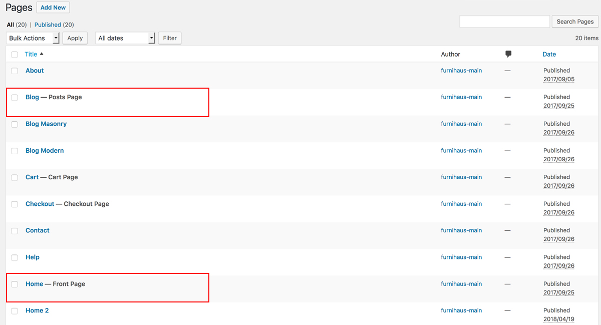
Next, navigate to Settings > Reading. At the top of this screen, you'll see a section titled "Front page displays". Click the little bubble next to the "A static page" option.
From this option's "Front page" drop-down menu, select your newly created "Home" page.
From the "Post page" drop-down menu, select your newly created "Blog" page.

- The Front Page Display setting allows you to choose what content appears on your blog’s front page. You can decide if you want posts, or a static Page, displayed as your blog's front (main) page.
- Front page: Select in the drop-down box the actual Page that you want displayed as your front page.In this case, we choose Home.
- Post Page: Select in the drop-down box the name of the Page that will now contain your Posts. If you do not select a Page here, your Posts will only be accessible via other navigation features such as category, calendar, or archive links.
- Blog pages show at most lets you choose how many blog posts are displayed per page. The default setting is 10 posts per page.
- Syndication feeds show the most recent lets you set how many blog posts will be sent out at once via your RSS feed (located at http://your-domain.WordPress.com/feed/).
- For each article in a feed you can select Full text or Summary. Full text means that the entire contents of a post are included in the feed. Summary means that only the first 55 words are included in the feed, along with the option to continue reading the rest of the post.
- After that Save Changes to apply the changes to your WordPress site.
The last step involves adding your "Home" and "Blog" pages to your navigation menu.
To do so, go to Appearance > Menus. Click the "Pages" drop-down menu on the left, check the boxes next to your "Home" and "Blog" pages, and add them to the menu. Drag and drop them to wherever you'd like them to be positioned in your menu. Be sure to save when finished.
Now, when you refresh your site, your homepage will display your newly created "Home" page and your "Blog" page will now display your post feed.
Blog Settings
Creating a Blog Page
By default Wordpress displays blog posts in front page but this theme uses a static page as its front page. So we'll have to create a new page called Blog and will use it to display the blog posts.
To display your blog posts, you will then need to create a page that includes the Blog, Recent Posts or Posts Carousel page builder asset.
- Navigate to Pages > Add New.
- Enter the title Blog and click on Publish.
Note: DO NOT set the posts page in Settings > Reading, as this will force your page to show the archive layout, and not follow your created page. You can choose blog page layout from Zutta Theme Options panel > Blog Settings. Currently there are three types of layout: Classic, Masonarry and Modern
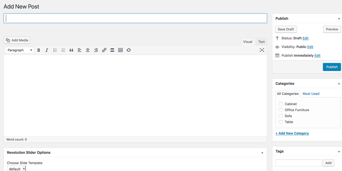
Creating a Post
The Posts menu option on the left is where you add blog posts. To add a new blog post, select the Posts > Add New option from the left hand WordPress menu.
Once you're on the Add New Post screen, you will then be able to set a title for the blog post, add the body content, and also provide all the meta information such as extra details and media. In the blog meta you can set the image for the thumbnail, and also the media type for the detail page.
Shop Settings
Setup WooCommerce
Zutta is an ecomemrce WordPress theme and WooCommerce is the main plugin which provides all functionalities about selling products online. If you are new with WooCommerce plugin, please take a look at its' documentation first - WooCommerce Documentation
After WooCommerce installed and activated on your website, it will require you to do some setup steps. You should follow it to complete the installation. In these steps, WooCommerce will recommend you to create some pages such as: Shop, Checkout, Cart, My Account page.
If you imported our demo content before, you can skip this step to avoid duplicate these pages. Because they are imported from our demo content. And if you skip this step, you must go to WooCommerce > Settings and select these pages manually.
The Products menu option on the left is where you can add and manage products. To add a new product, select the Products > Add Product option from the left hand WordPress menu.
Add a Product
Once you're on the Add New Product screen, you will then be able to set a title for the product item, add the description, and also provide all the data information such as price, stock status, attributes, etc.

You can add a featured image in the right column box, and above that set any other gallery images. Any images you add here will be used for the product slider images.
Create a new Category
Creating categories is one of the easiest ways to organize your products. The more products you have, the more benefit you will receive by organizing into multiple categories. What do categories do? They allow your customers to easily sort and navigate your products.
- To set up your product categories, click the Categories link under Products Menu in your WordPress Dashboard.

Setting A Shop Page
To display your products, you will want to create a page, leave the content blank, and then set the Shop Base Page in WooCommerce > Settings > Pages.

If you would like to add products within a page that you create using the page builder, you can also use the Products & Products (Mini) assets.
Order Tracking Page
If you want to have Order Tracking page, you must create it manually. But if you imported our demo content before, you can use the page we created for you.
To create Order Tracking page, please go Pages > Add New to create a new page. You can name this page as "Order Tracking" or anything else you want. Inside that page content, please insert this shortcode: [woocommerce_order_tracking]
After created the Order Tracking page, please go to WooCommerce > Settings then select Checkout tab. You will see an option for selecting what page is Order Tracking page.
Columns & Grid
Bootstrap Grid
Side Panel
You can add a revealable Side Panel on your Website with Additional Information about your Website. Simply use the Code below:
<div id="secondary" class="sidebar-area">
    <div id="search-3" class="widget widget_search">
        <h2 class="widget-title"><span>Search</span></h2>
        <form role="search" method="get" class="search-form" action="...">
            <label>
                <input type="search" class="search-field" placeholder="Search …" value="" name="s">
            </label>
            <input type="submit" class="search-submit" value="Search">
        </form>
    </div>
    <!--search-->
    <div id="recent-posts-3" class="widget widget_recent_entries">
        <h2 class="widget-title"><span>Recent Post</span></h2>
        <ul>
            <li>...</li>
            <li>...</li>
        </ul>
    </div>
    <!--archives-->
    <div class="widget widget_categories">
        <h5 class="widget-title">Categories</h5>
        <ul>
            <li>..</li>
        </ul>
    </div>
    <!--categories-->
    <div class="widget widget_archive">
        <h5 class="widget-title">Archives</h5>
        <ul>
            <li>..</li>
        </ul>
    </div>
    <!--archives-->
    <div class="widget widget_tag_cloud mb-30">
        <h5 class="widget-title">Tags</h5>
        <div class="tagcloud">
            <a href="#">..</a>
        </div>
    </div>
</div>
Helper Classes
We have created some really useful helper classes for you. Here are a few of them:
.small-text- for smaller font size.med-text- for medium font size.large-text- for large font size.xl-text- for bigger font size.sec-gap- fort section margin/gap.sec-pad- fort section padding.image-effect- for animation effect in images.bg-grey- for soft grey background.bg-black- for dark background.bg-white- for white background.write-mode-v- to write display text vertically.overflow-hidden- to hide overflowing elements.has-gradient-overlay- for gradient overlay.mb-100- margin bottom 100px.mb-90- margin bottom 90px.mb-80- margin bottom 80px.mb-70- margin bottom 70px.mb-60- margin bottom 60px.mb-50- margin bottom 50px.mb-40- margin bottom 40px.mb-30- margin bottom 30px.mb-20- margin bottom 20px.mb-10- margin bottom 10px.mb-0- margin bottom 0
Elementor
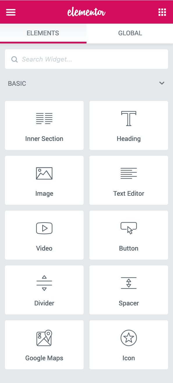
Elementor is one of the best drag and drop visual builder plugin which will help you to create any type of design using its drag and drop feature. You can easily create any layout for your website. This plugin is one of the best and most popular plugin for WordPress. Elementor comes with lots of pre-built elements which will help you to achieve any level of design/layout you need with just dragging the element into the canvas.
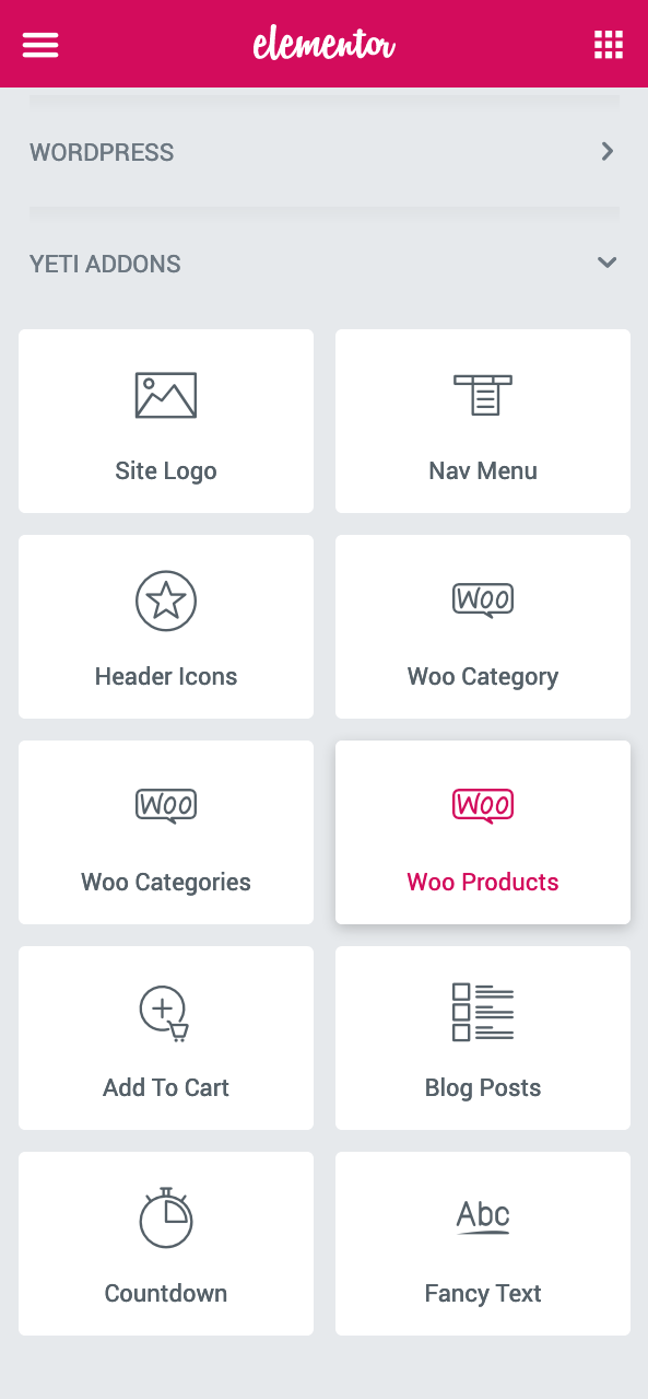
Yeti Addons
Apart from lots of pre-built elements within the Elementor itself we have also added other extra elements that is specific to the Zutta theme requirements. These elements will give you one more extra level of extension to the Elementor plugin.
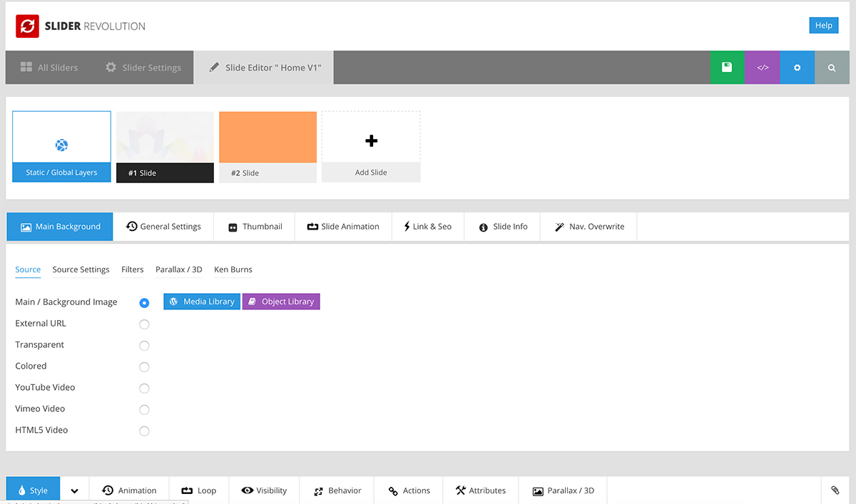
Slider Revolution
In this theme, we use Revolution Slider for building sliders on homepages. Revolution Slider is an innovative, responsive WordPress Slider Plugin that displays your content the beautiful way. Whether it’s a Slider, Carousel, Hero Scene or even a whole Front Page, the visual, drag & drop editor will let you tell your own stories in no time!
Everything you need to know for building your sliders or just for customizing imported slider from our demo is in this plugin's documentation. We highly recommend you to take a look at it here: Revolution Slider Documentation.
Creating Child Theme
A child theme is a theme that inherits the functions and styles of the other theme, called the parent theme. Child themes are the recommended way of modifying an existing theme. Our theme has full support for creating child theme.
How to create child theme
A Guide To: WordPress Child Themes Development
How to speed up you site
There's a lot on information on how to make your site work faster on the Internet. We are going to list certain general recommendations below, as well as recommendations on Zutta theme customization.
-
It's important to choose a nice hosting for your site. Cheap hosting usually isn't the fastest one.
WordPress, WooCommerce and our theme need resources. A $3-per-month host most likely won't have them, and your HandyTheme experience, as well as our support duty, will turn into a nightmare.
We usually recommend WordPress hosting plans from MediaTemple to be used with our themes.
-
You can use caching plugins.
We recommend acuiring and activating one of such plugins after your site's development is over.
Most important ones are:
-
You can use CDN.
What CDN does is it creates copies of your site's static content (images, css and javascript files) on different servers around the world. When a visitor comes to your site, he or she gets these static files from the nearest server. So, let's say, North American visitors get your site's files from Canada, and European visitors get them from Norway. This increases your site's loading speed dramatically.
Here are some of the popular CDN service providers:
-
You can optimize your images.
Images usually are the "heaviest" part of your website and take the most time to load. Reduce your images' initial sizes online or offline before uploading them to your site.
These are some of the popular online services for image size reduction:
These are some of the popular offline applications for image size reduction:
- For Windows: http://psydk.org/pngoptimizer
- For Mac: https://imageoptim.com/
-
You can optimize you database.
The essence of database optimization is deleting drafts, not used (deleted) elements, such as spam comments etc. from your database.
These are some of the popular plugins for database optimization:
-
You can minify your css and js
After your site's development is over you can minify all your styles and scripts
Online services for css:
Online services for js:
Plugins:
Useful links on the matter:
- http://www.smashingmagazine.com/2014/06/25/how-to-speed-up-your-wordpress-website/
- http://www.sparringmind.com/speed-up-wordpress/
- http://code.tutsplus.com/tutorials/speed-up-wordpress-caching-and-database-optimization--cms-22055
- http://code.tutsplus.com/tutorials/speed-up-wordpress-using-cdns-compression-and-minification-to-speed-up-wordpress--cms-22056
CSS & Fonts
- Bootstrap
- Animation
- Font-Awesome (Font Icons)
- BX Slider
- Stroke 7 Icon Font (Icons)
Free fonts:
Note: Images used in the demonstration/preview images/screenshots are licensed to their respective owners and are not included in the download. All images used in the preview mode where companies logo are visible are copyrighted to its respective owners/companies. Useage of those images in your end product/project will be solely your responsibility and commercial license will be required from its owners/companies. All images are replaced with placeholder images in download files.
Once again, thank you so much for purchasing this template. As we said at the beginning, We'd be glad to help you if you have any questions relating this template. No guarantees, but we'll do our best to assist. If you have any suggestions on how to improve our templates or documentation please share them!
© 2020 Kaththemes. All Rights Reserved.